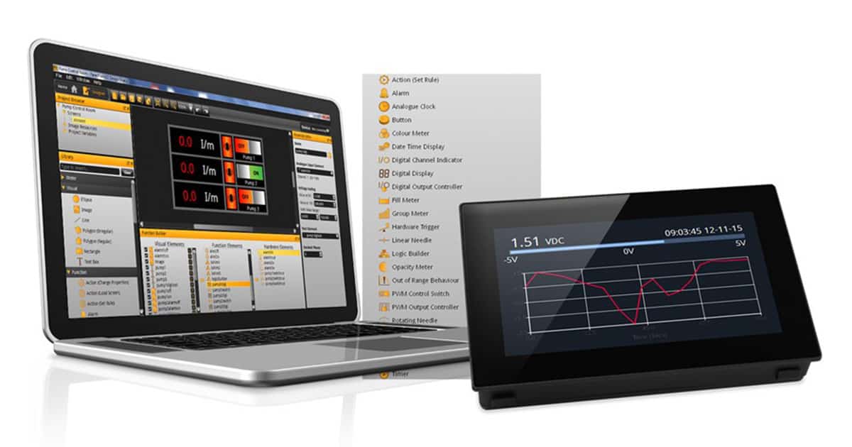
With modern touchscreen color displays and embedded computing, engineers and developers now have the hardware to create multi-screen, interactive interfaces for industrial instrumentation and panels. So here are Five Tips for Good Industrial Interface Design.
1. Big, bold and contrasting
In most instances, a display’s primary function is to impart information, and good design is vital to this function being carried out successfully. Text and digits should be large and clear while background elements should be of a contrasting color to the elements which impart the information.
2. Storyboard, prototype, beta
It goes without saying that if your industrial interface is difficult to navigate or hard to understand then it’s not doing its job. Storyboard your entire interface design on paper before starting work on the actual thing and share this with colleagues to ensure that they see the logic in your thinking. When you have a prototype up and running, ask some different colleagues (or even some of your customers if you’re feeling brave) to have a look at it and provide feedback. Beta testing can be a humbling experience, but your design will be all the better for it.
3. Less is more. Don’t try to fit too much onto the screen
When creating an industrial interface design remember the size of the screen that the design will be shown on during run-time, if things are squashed and cluttered then the information is harder to read. Think of adding additional screens to show more detailed information with only the headline info showing on the main screen. For example, does an operator absolutely need to know a particular value, or is a go-no-go signal enough for the main screen?
4. Don’t make navigation an exercise in precision
Dainty fingers’ and ‘machine operators don’t tend to be associated with each other. As such make sure buttons and touch-screen elements on your interface are large enough to be pressed without much care.
5. A picture says a thousand words
Good icon design can tell the operator what they’re looking at without having to read a thing. Bad icon design can make an interface impenetrable to the uninitiated. Don’t try and reinvent the wheel, most things you want to create an icon for will already have an accepted standard (think of the Windows ‘Save’ icon or a ‘Settings’ icon). Google Images is your friend here because a quick search is likely to show you hundreds of designs for a particular icon which are all variations on a theme. At this point, your conscience will tell you how much to iterate to avoid blatant copying!